How to make a painting look more 3D
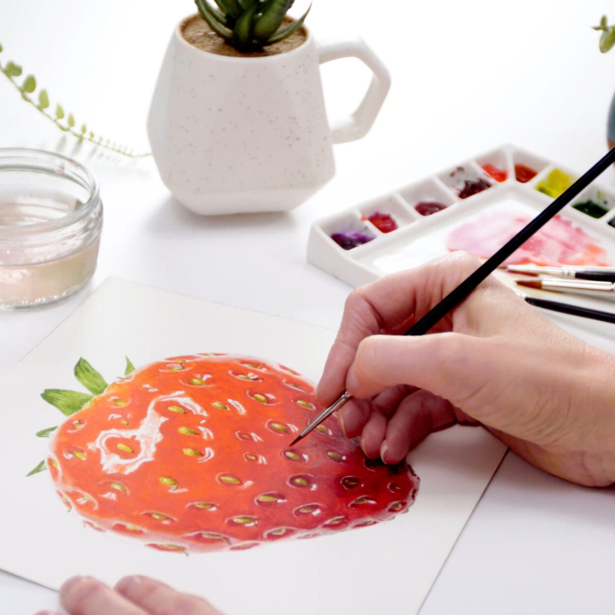
Do you ever feel that your watercolor painting has fallen a bit… flat? If so, you’re not alone: this problem is really common. And the good news is that it’s totally fixable. So in this mini class, I’m going to guide you through the transformative process of how to make a painting look more 3D and take it from “meh” to “WOW!”
Understanding the challenge
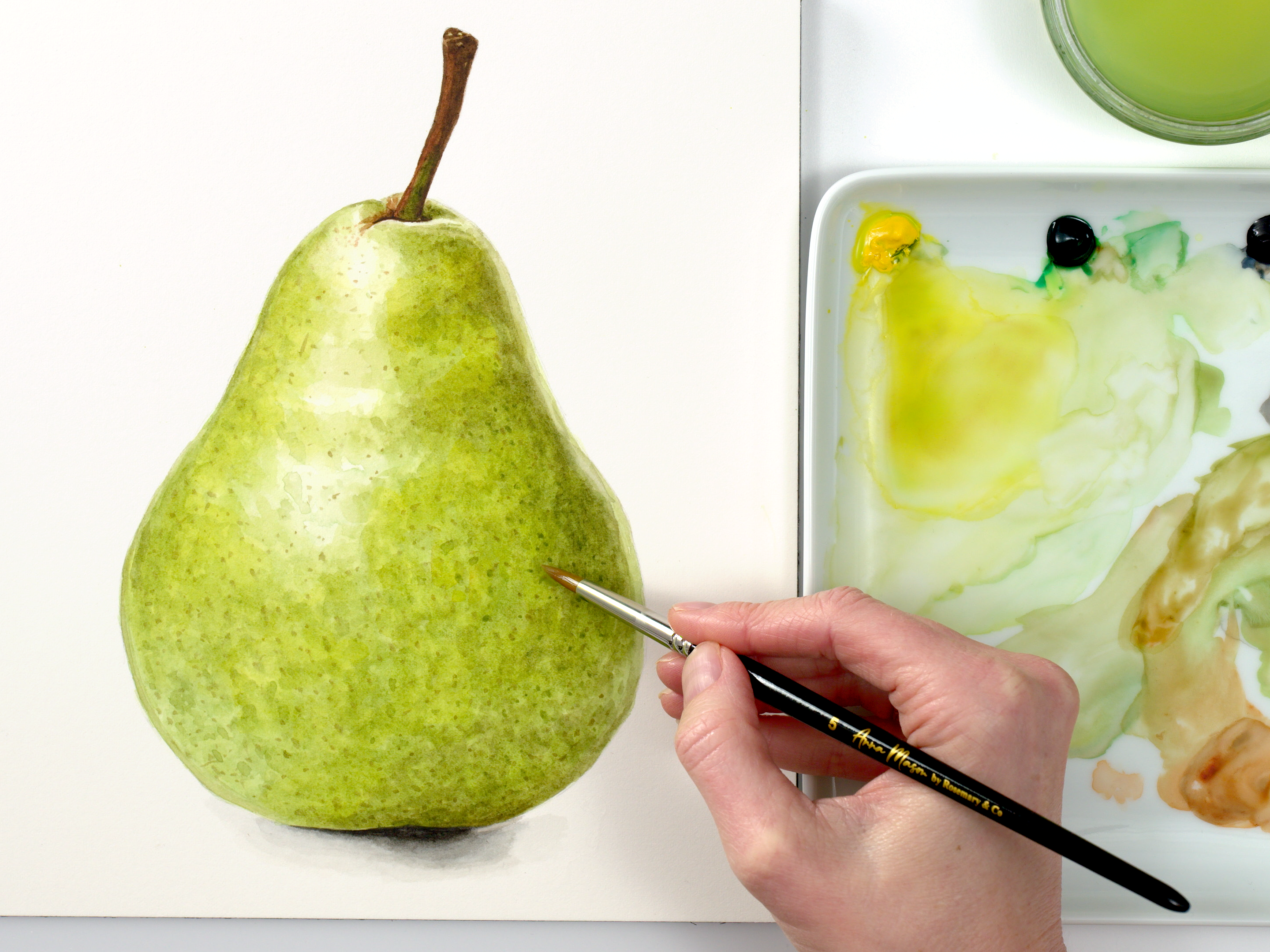
If a painting’s looking too flat, that means it’s lacking in tonal contrast. There is not enough difference between the lightest highlights and the darkest tones in the painting, which are often the shadow areas.
When you paint with my easy watercolor method, your eyes get used to tuning in to seeing the different areas of tone (value) so much that it becomes second nature. But if you’re not used to judging tones, it can feel challenging. (Eventually it will just click, so don’t give up).
Usually a flat-looking painting will be towards the lighter end of the tonal range and it tends to happen to artists who are still developing their confidence and skills in judging tones.
Having a washed-out painting is actually a great position to be in, because it means you haven’t taken your the tones too dark so there’s lots of scope to enhance the 3D effects.
Watch the mini class on how to make a painting look more 3D:
So, to recap the key takeaway points on how to make a painting look more 3D:
1) Darken the darkest tones
Check to see if you’ve taken the darkest tones dark enough, and if not, darken those to match your reference image. A viewfinder can help you to judge this. Doing this establishes a reference point for the rest of the painting.
2) Then gradually darken the midtones
Moving on to the darker midtones, gradually add layers of paint to bring them into balance with the darkest tones, again using a viewfinder if it helps. If you’re feeling cautious, use pale or watery paint. By feathering the edges of the shapes it’s possible to create a smooth transition into lighter and darker areas.
3) Now revisit the highlights
If your painting was looking washed out, the fixes you’ve made so far will likely mean the highlights are now looking too light, and the painting may be looking disjoined – but it will come together. So now check those areas and darken if they need it.
If any of the highlight areas are looking too dark, here’s how you can bring them back.
Use this method to rescue any ‘flat’ watercolor paintings
By following this process and working in layers (always making sure the area you’re painting over has fully dried), you see the transformation as your painting gains a 3D quality. It will also help to to make sure the colours stay vibrant.
Remember that artistic confidence comes not only from creating frame-worthy artworks but also in learning how to tackle problems and make good judgements.
Has this mini class inspired you to revisit any shelved projects? I’d love to know if you apply this tips and how well they work for you. And I’d love to hear from you if you enjoyed this video. So please leave me a comment below – I love to read them.
Is your painting looking flat and unrealistic? I’m going to help you fix that.
Hi, I’m Anna Mason, welcome to this episode of Nature Studio TV – helping you give your paintings the wow factor. In this series of videos I’m looking at how you can fix some common mistakes with your painting to improve your work.
Often I see pictures ,especially watercolours, that look a little like this. They’ve managed to achieve a bit of shape or form but they’re looking a bit washed out. Too pale overall. They lack pop, or contrast. They fall flat.
So what do you do if your paintings keep ending up this way? Firstly, you congratulate yourself because you’ve not taken your watercolour too dark anywhere – so you can easily improve your painting simply by darkening your darkest tones and midtones up.
Let’s start with the darkest tones. The darkest part of the apple is the dark brown stem. If we can paint that as dark as it needs to be, we can adjust our apple colours with that as our reference on the paper to compare to.
When we assess the value, or as I call it, the tone of a part of our painting- that is, how light or dark a colour is – our perception of it is affected by the other tones that are around it. So in this case if our stem is too pale, then darkening up the darker areas of the apple won’t look right – and we won’t do it.
So, buy a viewfinder like this – or make your own by getting some mid grey colour card and make a hole in it. Hold it over your reference – in this case the photo – and look at the darkest area. Compare it to your painting. We want them to match.
Making sure your painting is dry, go ahead and add another layer of thicker paint to the darker areas. You can test your colours out on some scrap paper, or in the corner first if this makes you nervous. Remember, check with your viewfinder if you’re unsure.
With the darkest area dark enough, it should be clearer how much darker you can take the darker areas in the apple. They’re easier to identify when we look at the apple in black and white and turn them yellow.
So our next step is to work on those darker midtones within our painting next. Again, go ahead and add another layer to those using thicker paint. Or, if you feel nervous, use some quite pale paint, you can always darken gradually by adding lots of layers, so long as your paper is good quality and absorbs well, and you let it dry off between layers.
If you make feather markings on the edges of these darker shapes of colour, it’ll make it easier to achieve a graduated transition along those edges as you darken them up.
The painting looks messy and disjointed now, but the next step is to darken the lighter midtones. Watch the apple come together again as I darken those midtones… starting with the areas that link up to the darker areas, and working into those feathered transitions to smooth them.
Then you can check: do the highlights need darkening some more? Remember, you can check with your viewfinder. Often they just need a really subtle adjustment with really watery pale paint. And you can also use this as an opportunity to work into the edges of highlight to soften that transition by blending it.
And there you have a much more vibrant apple – full of 3D form and leaping off the paper. A painting like this has more impact, and more realism.
So if your watercolours, or any other paintings, are looking too flat and pale – go through this process and you can not only
save your painting from the bin, but you’ll gain confidence so you can really enjoy doing it.
Browse more blog posts
Share this post!
6 Comments
Leave a Comment
Share this post!
Subscribe to blog updates
Blog Updates
The information you provide here will be used only to deliver the email course, along with other relevant updates from me. You can unsubscribe anytime. Click here for our privacy policy.


That was very informative .. thank you Anna x
Anna, your advice is very useful. Thank you very much.
I enjoyed that and found it very useful. I shall look out for more. Thanks Anna.
That was a great help.thank you🧚♀️❤
Thank you so very much Anna! I am new at watercolor and this short video has given me great guidance! I can’t wait to apply your process to my next painting. I will definitely try the view finder; what an awesome suggestion. Thank you again!
Thank you, just what I needed as my watercolours always look flat.