How to preserve highlights in watercolor
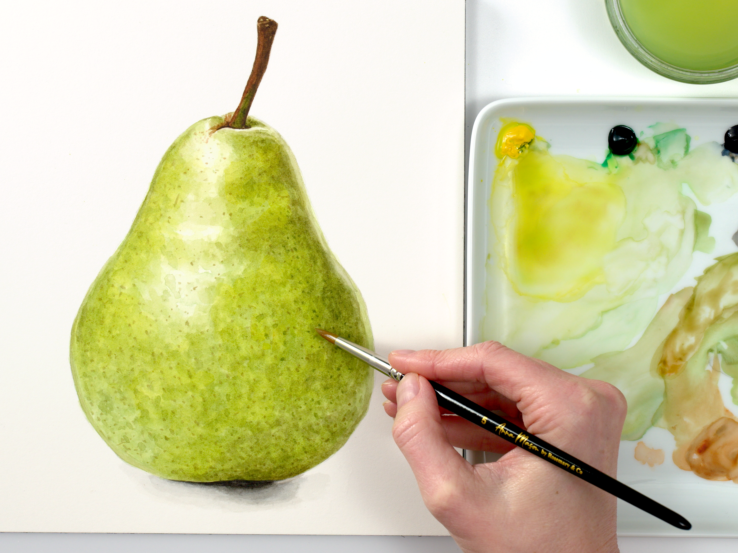
When you closely observe a realistic, 3D watercolor painting, your eye will naturally be drawn to all the details and marks the artist created. Less obvious, though of equal importance, are all the areas the artist didn’t apply paint: the highlights. With watercolor, highlights are ‘preserved’ by allowing the white colour of the paper to show though. If this sounds complicated, don’t worry, because in this mini class I’ll share an easy method for how to preserve highlights in watercolor.
This technique can truly make your art come alive, adding that sought-after 3D form, contrast, and intrigue.
Why Retaining Highlights Matters
Highlights are more than just brighter spots in your painting; they are the key to unlocking dimension and depth. Whether it’s the glistening surface of a strawberry or the subtle sheen on a tulip petal, understanding how to preserve highlights in watercolor is an essential skill.
How to preserve highlights in watercolor:
So to recap my process for how to preserve highlights in watercolor:
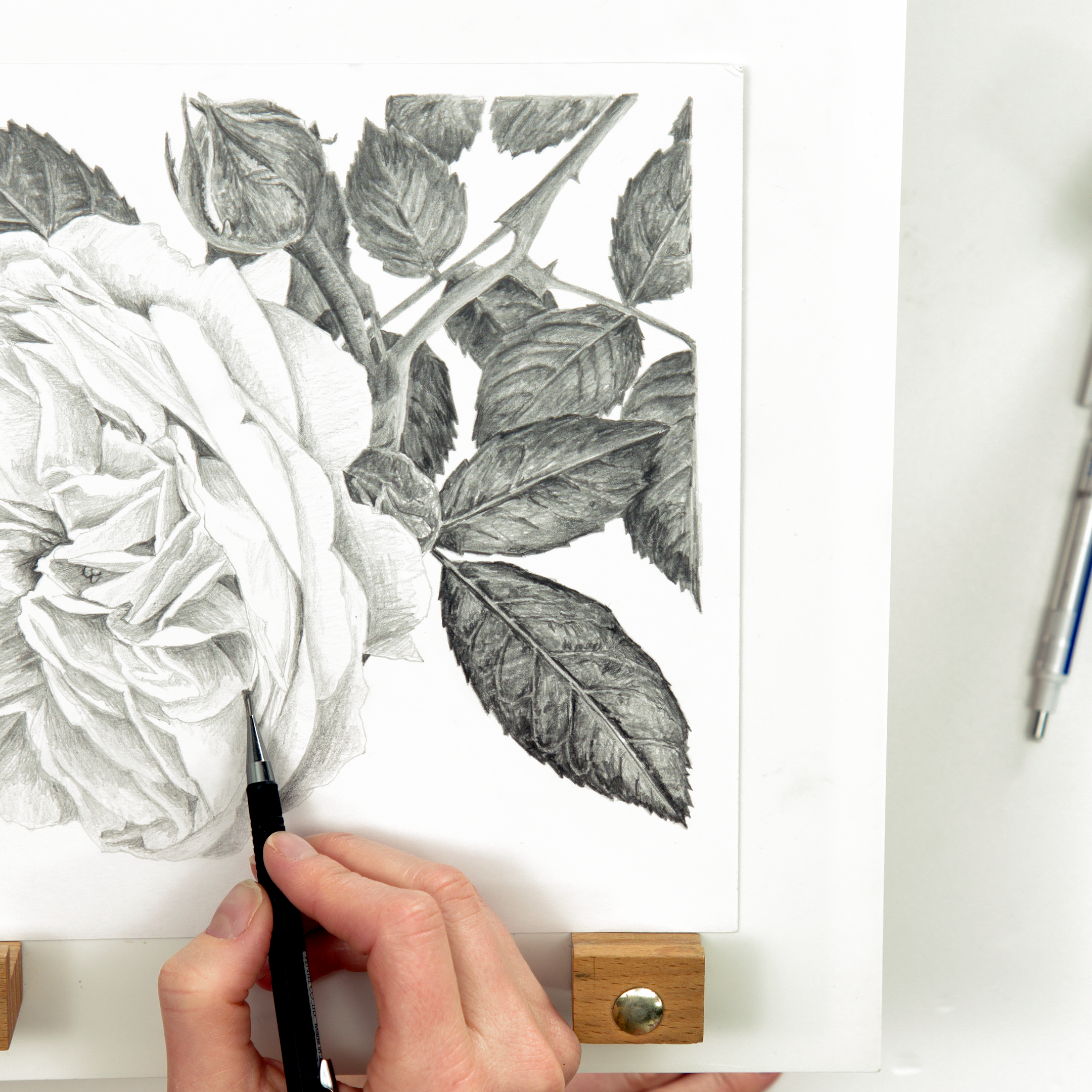
I always recommend working from a photo reference to make it easier to observe shapes of colour and tone (value). For very shiny subjects e.g. strawberries or cherries, the camera captures the naturally illuminated areas, and as long as the surrounding area isn’t too pale, I faintly outline the highlights with a pencil, being careful not to make the marks too dark.
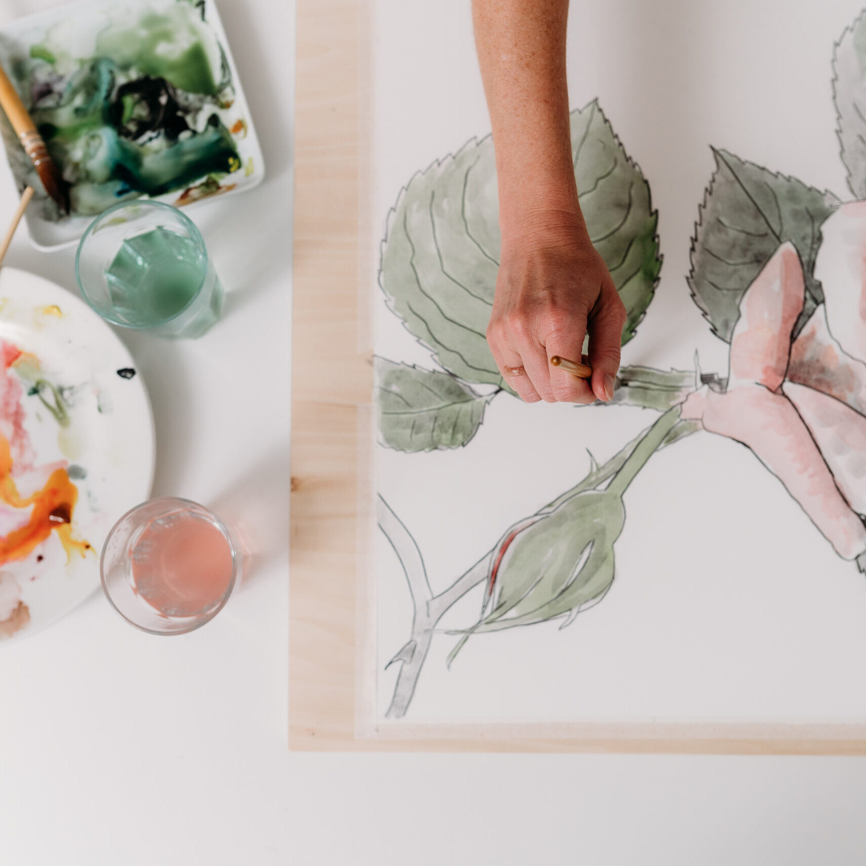
When there’s a more subtle transition between a highlight and the surrounding areas, I skip the pencil outlines and use a very watery layer of paint to map out the highlights in the very early stages. Taking extra care at this point in a painting to make it clear where those highlights should be placed. Once the highlights are mapped out, it’s then possible to ensure they remain untouched by subsequent layers as the painting progresses.
Subtle darkening: keeping a light touch
I would then continue building up the painting, following the 4 simple rules of my easy watercolor method.
As the painting developed, and the darker tones are in place, it then becomes easier to judge how much to darken the highlights.
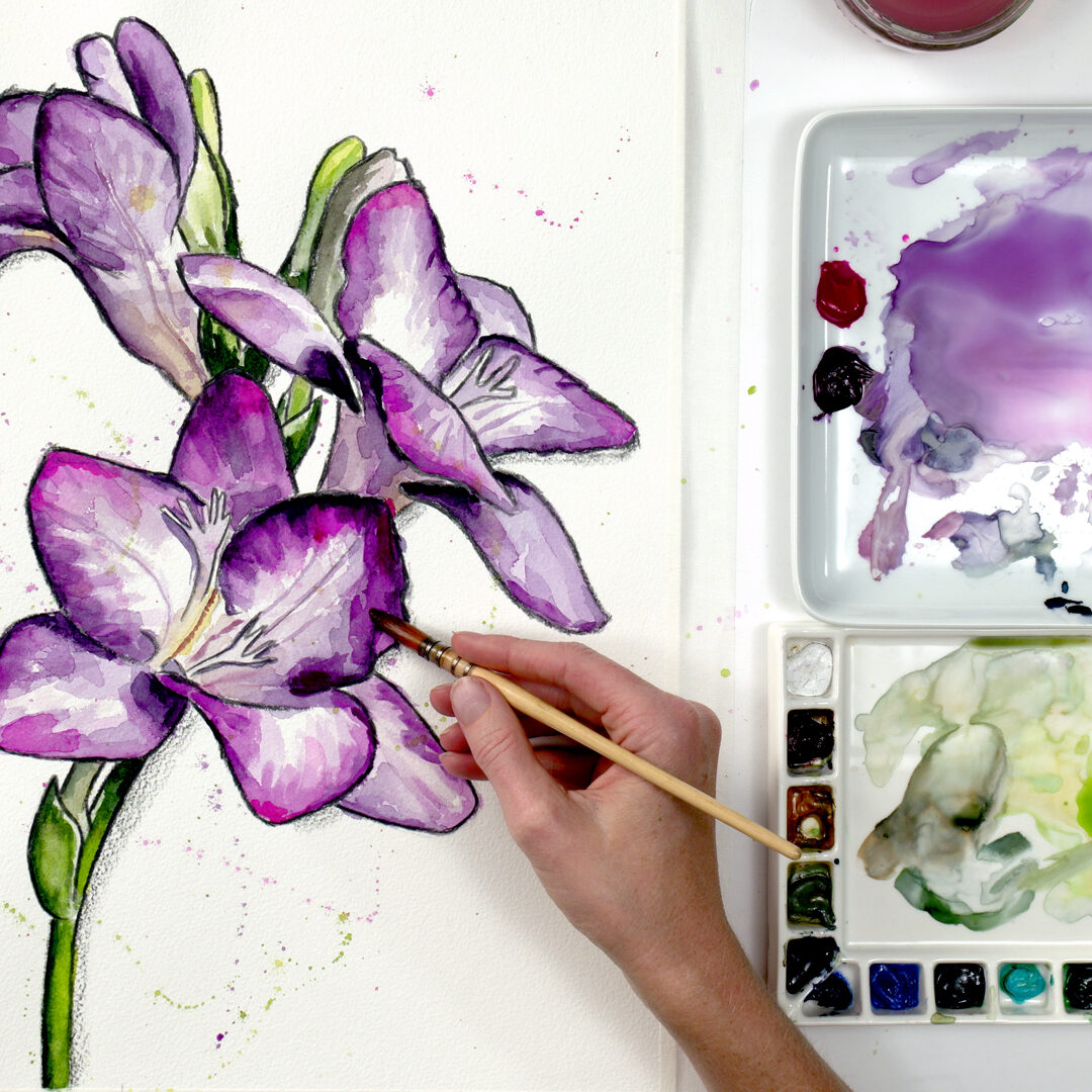
It’s much easier to keep adding another pale layer than it is to fix a highlight you’ve taken too dark, so at this stage I recommend a cautious approach, with a light touch and working in very pale, watery layers.
I’d then conclude as always with the final adjustments. Whether it’s adding details or refining transitions, I use pale, dilute paint and take care not to lose the highlights I’ve preserved.
Now you know how to preserve highlights in watercolor, I hope you’ll enjoy practicing the tips and techniques I’ve shown you. I’d love to hear from you in the comments below if you’ve enjoyed this mini class. Have you struggled with preserving highlights in the past? Will you be using these tips in your next painting? Let me know…
I hope this inspires you to try painting fur this weekend – and helps you to stay subtle with your paint!
If you enjoyed the video, please leave me a comment below, it always puts a smile on my face to read them.
Happy painting,

This technique makes a HUGE difference to how 3D your watercolour paintings will look. Let’s talk highlights.
Hi, I’m Anna Mason, welcome to this episode of Nature Studio TV – helping you become the Artist you want to be.
In this series of videos I’m looking at how you can improve your watercolour paintings to give them the WOW factor – starting with probably the most important thing to focus on: Retaining the painting’s highlights.
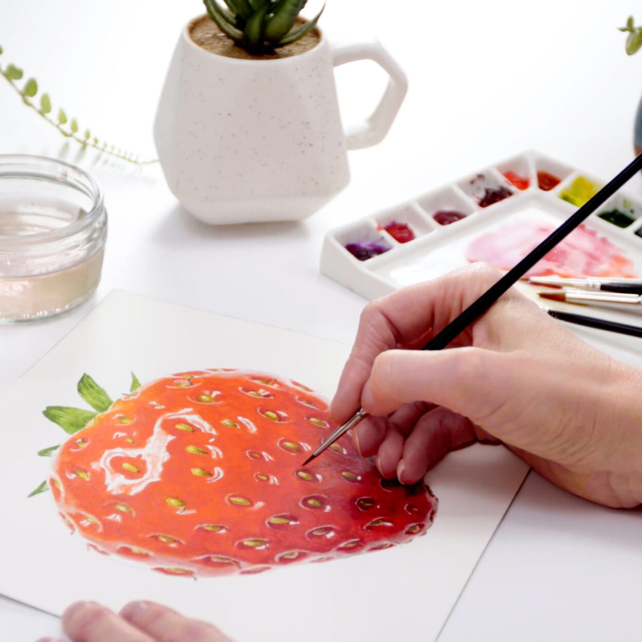
Highlights are part of what give our paintings 3D form, contrast and interest. Whether that’s on something overtly shiny like this strawberry, or something with more subtle sheen like this tulip flower.
But with watercolour, we can’t just paint a lighter colour onto our highlight areas if we take them too dark, as the transparency of the paint means the darker colour paint will show through underneath.
So the best thing is for us to retain our highlights by painting around them and only darkening them gradually – so that the white of our paper colour is visible through the paint in those areas. Here’s the way I handle it:
Firstly map out where the highlights go right at the beginning.
When working on something like this strawberry, that’s loads easier when you work from a photo, where the areas of highlight – that naturally move with the light – have been captured for you by the camera. The shapes of pale shine mostly have hard lines to them, so I recommend you draw them out with pencil first. You want to be careful not to make your pencil marks too dark is there’s a soft, or graduated transition into the colours around the highlight – as there often is – so you won’t end up with the pencil being too visible through the paint.
But for something like this tulip where the highlight is more subtle, and the edges of it less defined, it’s best not to use pencil first. I only outlined the edges to the petals with pencil here, but then I mapped out the highlights using paint in the first stages of the painting. Here I paint a very pale colour that was no darker than the highlights to the whole of the flower, let it dry, then paint a second pale version of the colour everywhere EXCEPT the highlights. I can see them going forwards so I’ll be much less likely to paint over them.
I do the same with something more shiny – like the strawberry – painting around my pencil outlines of the highlights and, as the highlights here are SO light, I leave them with no paint on them at this stage. Then I revisit the highlights when the rest of the painting is much darker.
The way we perceive tones, or values in our paintings is relative to the tones around them, so when we’ve applied the darkest tones and some midtones, it’s usually much more obvious that we can darken the highlights some more. Only when I’m confident that they’re too light do I go in with another layer to them. I always make sure that this layer of paint is really pale so only makes a sublte shift.
If it’s not dark enough we can always apply another layer – but it’s better to be cautious. We can apply as many layers as we like of these very pale colours, but it’s harder to lift off colour if we go too dark. Doing that subtle darkening of the highlights means I can then see how much darker to take the rest of the painting.
Then I’ll again use really pale, dilute paint to make any final adjustments. Which might include painting any details into the highlights – again I’ll keep my paint pale so I don’t take the highlights too dark.
I’ll also work into the edges of the highlights at this final stage to get those transitions looking right. Again, working with pale paint means this can be done gently and without losing the highlight – and using small brushes means I don’t get the whole area wet and allow the darker colours around to bleed into the highlight.
Follow these steps and you’ll be able to retain your highlights to give your paintings 3D form and have them pop off the paper!
Browse more blog posts
Share this post!
2 Comments
Leave a Comment
Share this post!
Subscribe to blog updates
Blog Updates
The information you provide here will be used only to deliver the email course, along with other relevant updates from me. You can unsubscribe anytime. Click here for our privacy policy.





Thank you Anna for showing me how to map out the highlights. I will try this as I am sure it will improve my watercolor painting.
Hi Anna,
I am new and find your article very informative. Not only for the actual process but also allowing me to appreciate paintings of others. Thank you