1) Cookies for the working functioning of the website including:
- Membership & Account Cookies. When you log into the website, cookies are stored on your machine which securely identify you as the user for the duration of your session. Without these cookies you would not be able to view any Members Only content, nor would you be able to manage anything related specifically to your user account such as uploaded images, bookmarks or forum posts.
- Cookies to help with e-commerce. This site offers e-commerce facilities and some cookies are essential to ensure that your order is remembered between pages so that we can process it properly, and that your order can be processed in your own currency.
2) Cookies for monitoring the effectiveness of the website:
- We use Google Analytics which is one of the most widespread and trusted analytics solution on the web for helping us to understand how you use the site and ways that we can improve your experience. These cookies may track things such as how long visitors spend on the site and the pages that they visit so we can continue to produce engaging content. The data collected is anonymised. For more information on Google Analytics cookies, see the official Google Analytics page.
3) Strictly necessary 3rd party cookies:
- Our public website contains videos which play through our site directly from YouTube. If you watch videos on our site, YouTube will use analytics cookies to count how many views the video has received. For information on YouTube and privacy, please refer to their guide on how to control your data in YouTube.
- Our site also contains videos for the full length tutorials, which play through our site directly from Vimeo. If you watch any of these videos, Vimeo will use analytics cookies to count how many views the video has received. You can find out more by reading Vimeo's Privacy Policy.
If you disable this cookie, we will not be able to save your preferences. This means that every time you visit this website you will need to enable or disable cookies again.

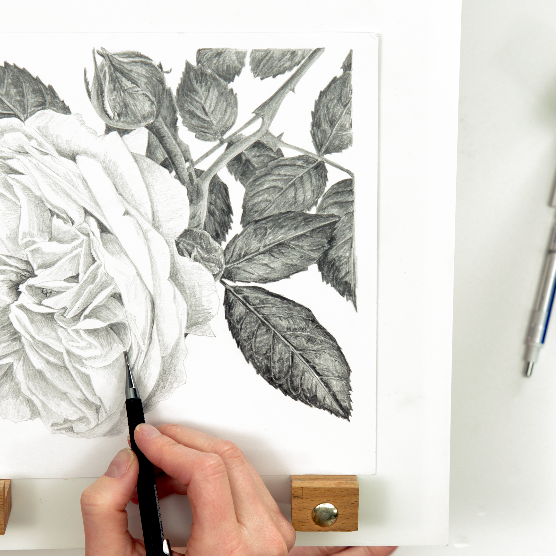
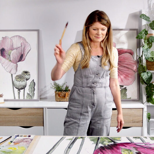
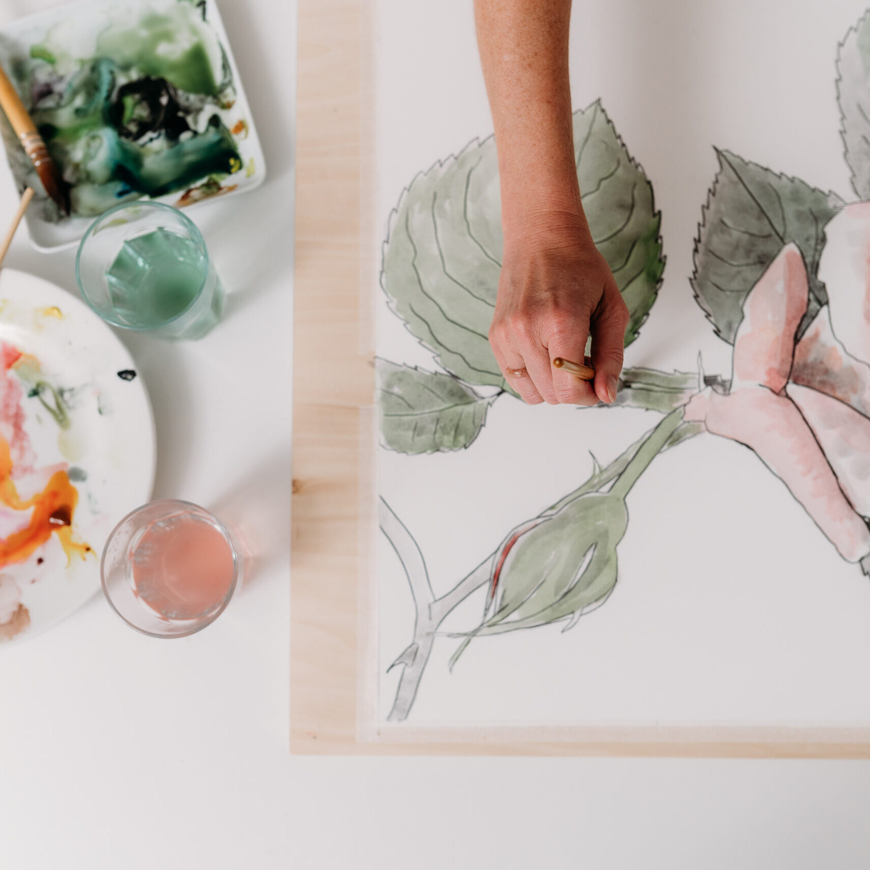
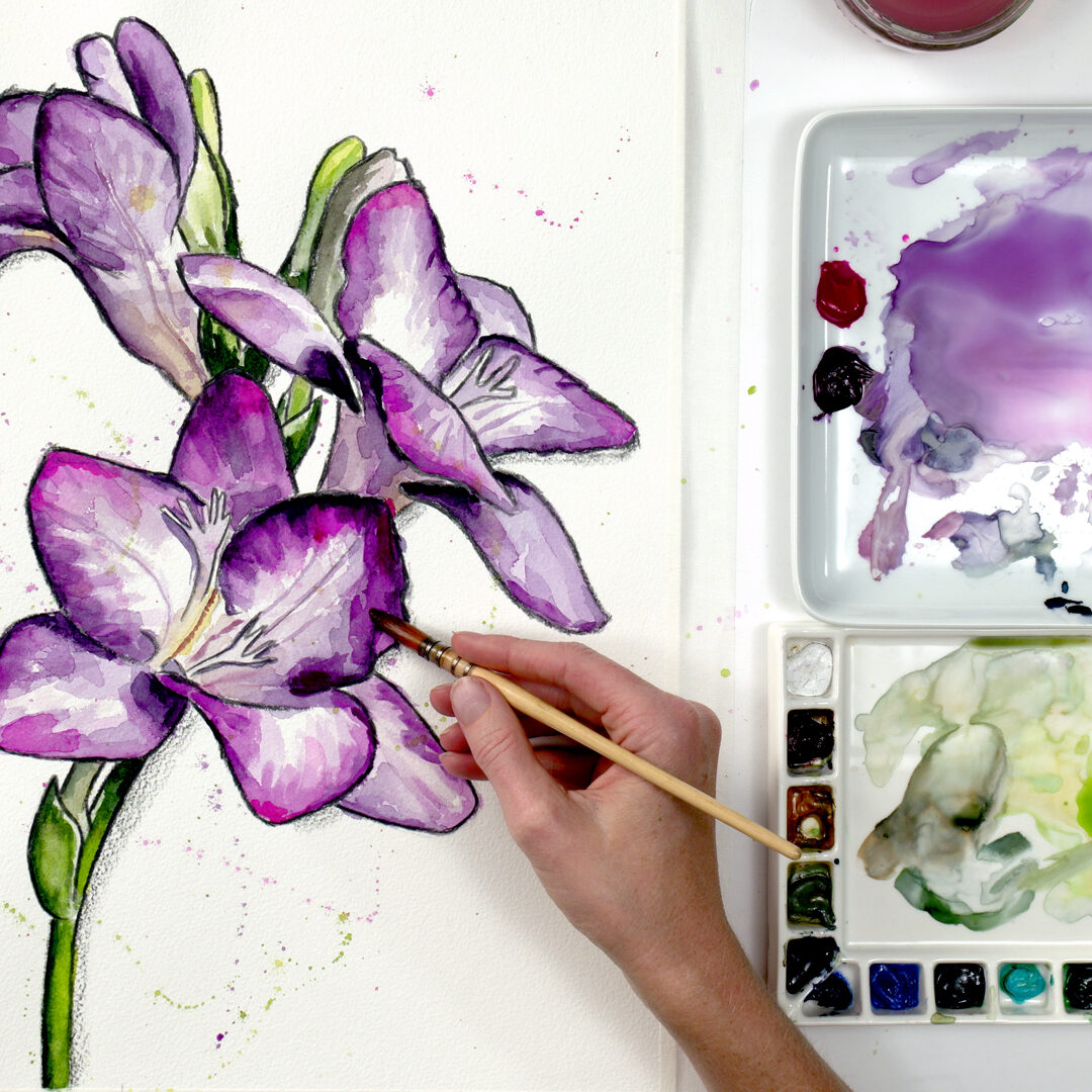
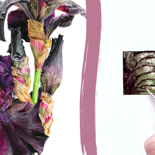
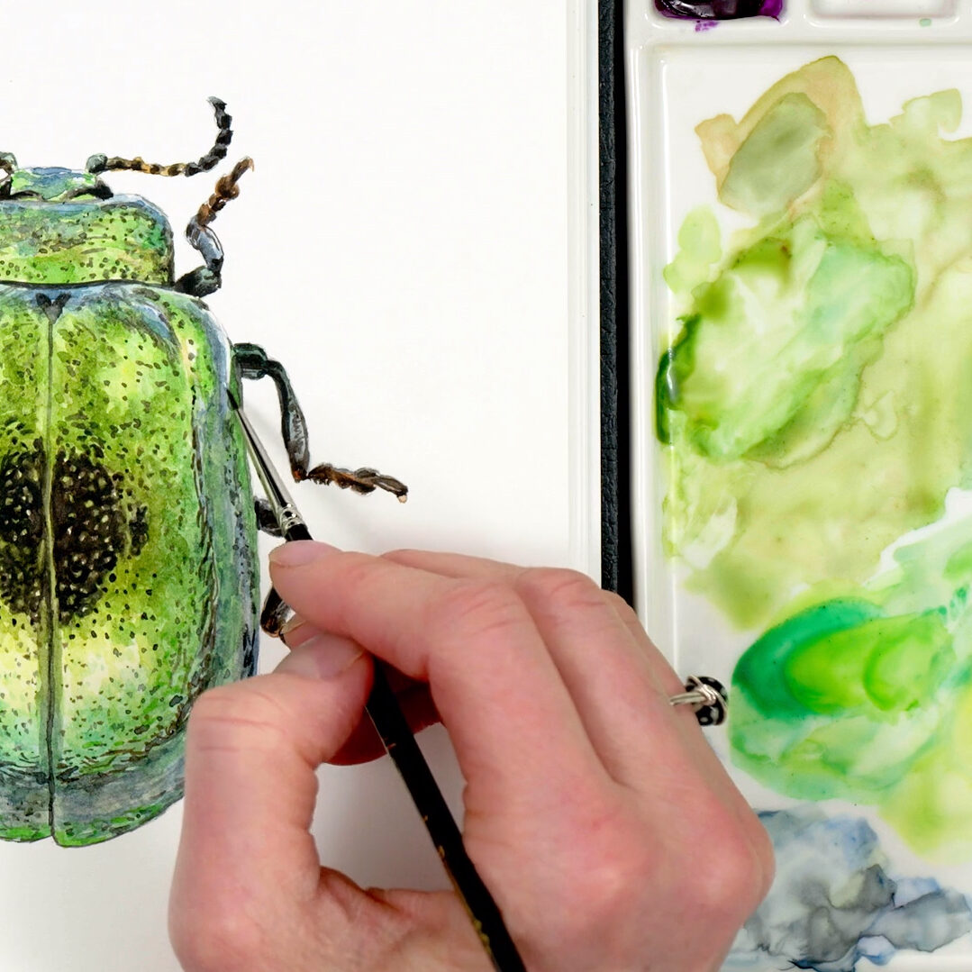
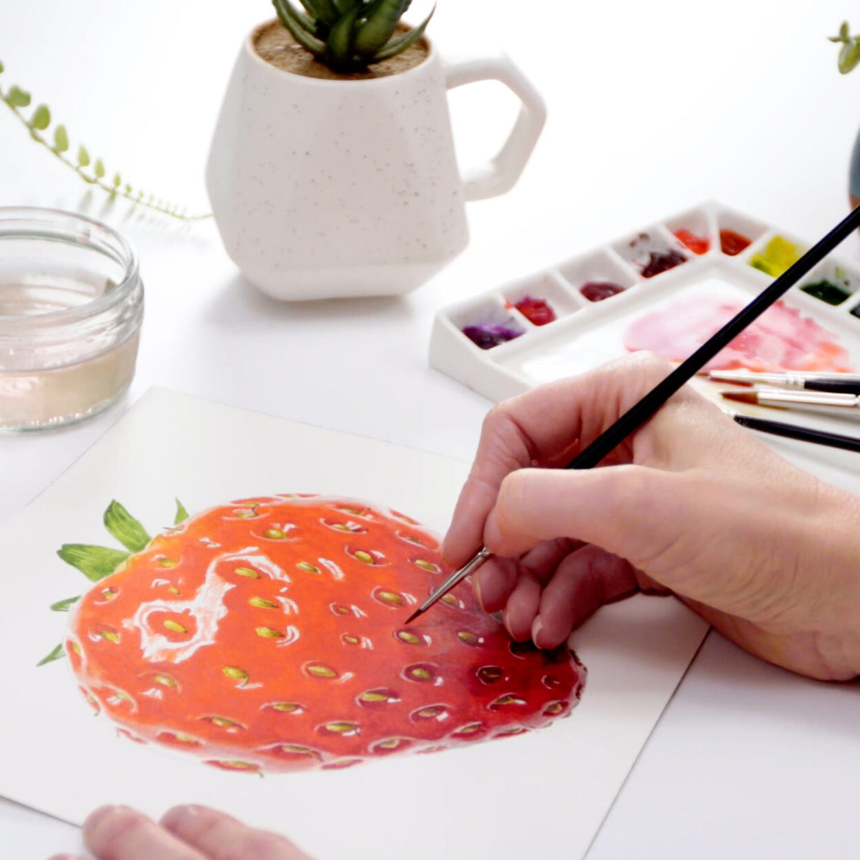


Anna, these videos are wonderful, and the light and your studio set are so pretty. Thank you for explaining about your paints and why you choose them, and the changes you are making to your paints and palette. I love the new porcelain plate. Simply perfect. Like everything you do, Anna, you and your team have done such an excellent job. I love the new look.
Oooooh… I’m excited!!!! Really looking forward to learning. Thanks, Anna. Your work is sublime!
most of my artworks are inspired by you Ms. Anna
thank you so much for sharing tip
hi-I recently purchased your book and noticed your palette in there includes 2 additional colors quin red and quin magenta. I haven’t been through all the online classes but did you use these 2 colors in older tutorials?
I had the same dilemma earlier. I noticed that Anna uses these colours in older tutorials and the book so I got them as well since the book is invaluable and I am planning to paint the tutorials. I hope this helps. Happy Painting.
First of all: I really like your work and look forward learning from your blog. It already helped me a lot!
I also have a question for you. I recently started watercolouring and have purchased the 6 essential paints by Winsor & Newton they mention on their website (Winsor Lemon, Winsor Yellow, Scarlet Lake, Permanent Rose, Winsor Blue (G/S) and French Ultramarine). However, I want to add some more colours to my primaries so I have 10-12 colours to start from.
Which colours would you recommend buying? I paint mostly animals.
Anna, I love the results you achieve but I have a basic problem. I have converted to a limited palette of single pigment paints. 6 paints – Cool and Warm versions of Red, Blue and Yellow. As I can mix most any color from this set I would like to continue with these and work mostly on your techniques as flowers are my current goal of mastery. Can this be done? Joe
You can try Joe, only for the really vibrant colours in flowers such as vibrant pinks and purples you’ll find you can’t get vibrant enough with your mixes. You need colours like Opera Rose and Quin. Purple (PV55) for them.
Thank you so much for these great videos !
It is hardly possible to find an online art school like yours, and I have really searched for 🙂
Although I am not a native speaker and it might be challenging sometimes I assume, I am really happy to have found you. Maybe here are other Germans around … 🙂
Very interesting…
Hi Anna, thank you for the tips and sharing your videos on different technique of paintings, I’m very inspired and did learned a lot more from your paintings Watercolour Wow!
Love, Angelina
Hi, here is Bia from Brazil. I would like some references to the wheel of colors you use. Where I can find texts about that Waldo (?) wheel of colors ?
Hi Anna
What does the “butter, milk and water” refer to in your paints list?
It’s an analogy to help describe paint consistencies Chris.
Could you tell us which tablet / iPad you use and which size?
Thank you!
it’s an iPad pro Mary
I’m new to your videos and books and looking forward to learning from you. I just downloaded the list of paints you use and have one concern….Opera Rose/Opera Pink is an extremely fugitive pigment. I have steered clear of this one even though it has a beautiful fluorescent quality. Can you explain your reasoning in using it and directing students to use it? I’m a long way from being a professional, but I still want what I create to last for generations and not fade away in a short period of time. Do you use this for your professional work?
Yes I do. I’ve covered this elsewhere but there have been big improvements in pigment technology in recent years and it’s not that fugitive any more!
Anna,
I am new to watercolor, and bought your first book. Now, I have joined your school and am so excited. In the book, you said that you vastly preferred the W&N pans to the tubes; but, in the videos you recommend and use the tubes. Has your preference changed? I want to invest in more paints, but I want to get the right ones.
Thanks!
Hi Maki, welcome to the School and sorry for the change! It actually doesn’t matter very much so long as you use the paint from tubes dry, so they behave just like pans. I did a video about the reasons for my change which you can check out here.
I am very interested in joining your on-line school, my querie is this, I do have quite a lot of artist quality watercolours, but as you can guess not the ones you are suggesting. I feel reluctant to purchase every colour as financial restraints. Would it be ok, if I use the paint that I already have, and just purchase a few specific colours.
Totally understand not wanting to keep buying Ann. So long as you have colours that are ‘transparent’, that’s the key as they will work well with layering. If they’re more opaque you may struggle to get the results you’re looking for and could get frustrated. The manufacturer should categorise them as transparent or opaque for you.
Hello, Anna. My, how talented you are! I’m very new to watercolor painting and was wondering how you store your porcelain plate palette when not in use. Do you cover it with plastic wrap? Place it uncovered in a drawer? Leave it out and uncovered? I can’t paint daily so was looking for advice as to how to store it once the paints have dried on it. Thanks!
Hi Amanda!I leave it out because I use it quite often. But you could cover with paper or wrap or something to stop it gathering dust if you needed to leave it for longer. It’s all dry so it’s not a problem.
I am going to start taking your classes but I have the Rembrandt set. Are the paint numbers comparable me to the W&N?
love the color wheel info. Thanls
Hello Anna, I’m delighted to have discovered your website and teaching, which looks fabulous, as too your stunning artwork. I’m very interested in embarking on your course and many thanks for your videos and PDF regarding recommended equipment, which is extremely helpful. I just have a question regarding paints, having recently bought a Winsor & Newton Cotman water colours set (pans) prior to coming across your website. Some of the colours you recommend are in this palette and with the exception of Yellow Ocre are all classed as Transparent/Semi-Transparent but are the Cotman range of sufficiently good enough quality for your teaching? Very many thanks.
Hi Marion – thanks for your message. Unfortunately the Cotman range contain a lot less pigment than the professional/artists range. The result is that the colours are duller and not as bold – and don’t tend to layer as well. That’s annoying I know as you’ve recently bought them. There’s nothing to stop you having a go using them but do be aware that you’re likely to struggle to get the same sort of result and it might be a bit disheartening. Good luck with your learning and I hope I can help you.
Hi Anna,
I’ve recently set myself up with all of the colors you use and bought a white plate the same size. Before I set up the plate I wanted to confirm with you that as the colors dry on the plate they are as easily accessible as when they are first put out? In using my old plastic palette with the individual wells I just spray the colors I am using to re wet them and had no danger of them running into each other. How do you keep this from happening given that the colors are so close together on the plate?
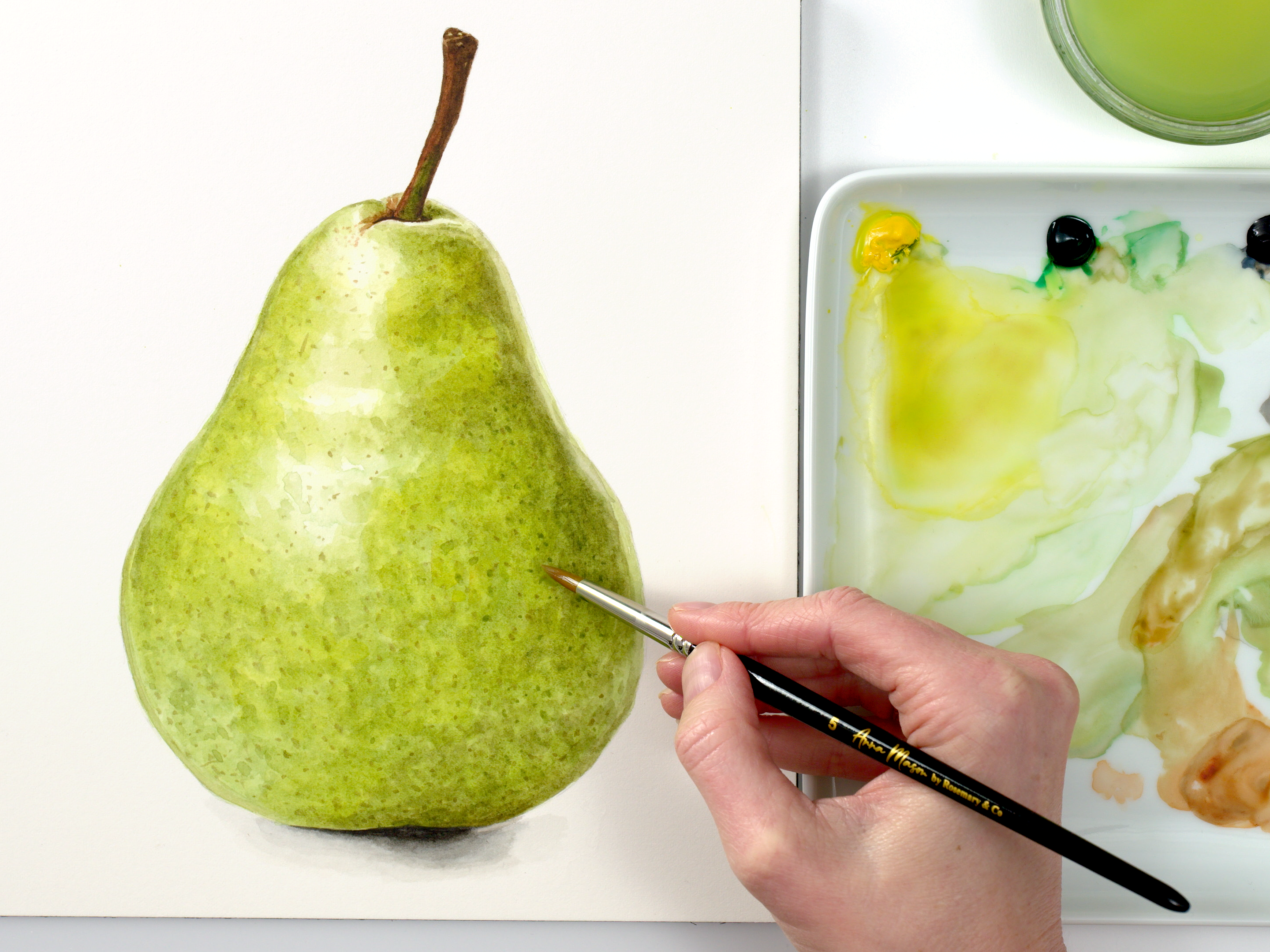
Der Anna, I have just finished the pear after your wonderful free tutorial and cannot believe that it was really me who painted it. I would love to book your courses. But I am wondering which of my Schmincke Horadam watercolors correspond to the colors you recommend. Do you have any idea how I could find out?
Greetings from the north of Germany
Jenny
Hi Jenny,You can get my full recommended paint list as a PDF on the equipment page. In there it tells you what their pigment numbers are so you can check those against the pigment numbers of your Schmincke paints (which you can get from their website).i hope this helps!
Name of supplier for your Bright VIolet used in the blue pansy painting
Hi, You can buy it anywhere, but here’s the link to the paint on the Jackson’s Art website. Hope this helps…
Anna, I’m going to be putting my tube paints into half pans in a palette rather than using the plate (for convenience as we drive back and forth between two homes in two different states and I don’t want to travel with the plate). Do you have a chart listing how you arranged the colors in the palette? Thank you.
Hi Janella, it’s exactly the same, you’ll just have to do them in rows instead of in a circle but you should still be able to put them in some kind of order by following the colour wheel at the bottom of this page…
This makes sense! Thank you.
Anna, I have been using Derwent Inktense block and pencils. Will I be able to use this product or will I have to use regular watercolor?
Hi Shirley, in theory you can use whatever you like – we’ve had students in the past who’ve attempted the tutorials with watercolour pencils. However, you’ll find it much easier to follow the tutorials if you’re using the same products as Anna, otherwise you’ll be doing your own guesswork a lot of the time with getting hues right etc., if that makes sense!
I have just joined your online watercolor classses. I am just a beginner but have purchased a few Daniel Smith paints. I see there is supposed to be a list of the Daniel Smith substitutions for your Windsor & Newton paints. The problem is I can’t find it. Every time I click a link expecting to see it I am referred back to a previous location. What am I doing incorrectly.
Welcome Connie, the list is included in the PDF which is found on the top of the Knowledge Base section of the School (Click the Pink symbol there to open it): https://www.naturestudio.com/school/knowledge-base/ or you can look up each colour in the Help Centre (off the main menu). The Help Centre covers everything and will also help you find the equipment PDF if you’re still stuck!
Good Afternoon, I have the color wheel printed out so I can start loading my plate but I don’t understand the placements of the Burnt Sienna, Payne’s Grey and yellow Ochre. It’s not in the middle of your plate. Thank you
HI Anna I followed you on utube in I think it was 2016 and subsequently joined your online school. I enjoyed panting the lovely viola and the gorgeous humming bird. Unfortunately I was unable to continue.
But recently I have decided to give my art a further try. I am always being told to get on with it by my son who is a brilliant professional artist painting huge Tigers so very different from your delicate work. I have your first book. I will now follow you on utube starting with your Robin for my Christmas card. Thank you for inspiring me regards Dot