How to achieve IMPACT: Use high contrast
A painting with high-contrast has a wide tonal range – from very light tones, to very dark tones. And creating high-contrast within a painting makes it appear more 3D.
Capturing the range between lights and darks replicates the way that light falls on our subject and tricks our eyes into believing that the subject in a painting is 3D.
And our eyes tend to be drawn to the area of a painting with the greatest contrast – where light tones meet dark tones. So having plenty of these areas within a painting makes it more dramatic and impactful.
I’m completely self-taught and have developed a watercolour technique in which working with contrast is fundamental. You can see from these photos of me painting a Cosmos, that I build contrast in from the start.
In watercolour we have to be so careful not to take any areas of our paintings darker than they need to be – because we can’t really lighten them again once we’ve done that. And because colour is relative (meaning it appears differently depending on the colours surrounding it), I find that it’s only by getting the lightest and darkest tones in place early on, that I can accurately assess how dark I need to take my midtones.
This Cosmos also demonstrates the fact that colour is relative and that high contrast creates much more impactful results. Once the dark area around the yellow centre is in place, the contrast is so strong that the yellow seems to jump out in comparison, drawing the eye and creating much more impact.
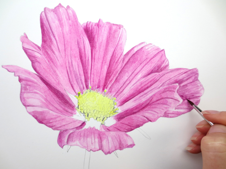
1) In the early stages of the painting I am already focusing on building in contrast, working on the lightest and darkest tones within the petals. Having the lightest and darkest tones in place allows me to work on the midtones with ease:
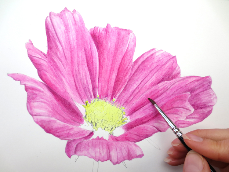
2) Working on the midtones is a process of bridging of the gap between the light and the dark tones. And once the midtones are in place, it is usually possible to judge that the darkest tones need a further and final darkening -again widening the tonal range:
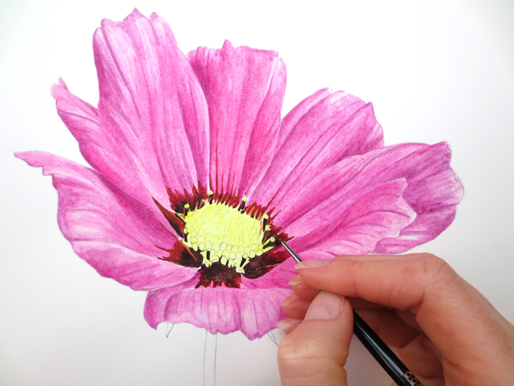
3) With the darker colour around the yellow centre, it appears much brighter:
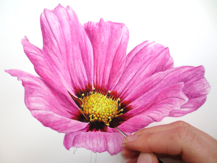
4) After I’ve worked into the yellow centre as well as further darkening the area around it, the centre of the flower contains high contrast with the light yellows right next to the darkest browns. This creates a really impactful focal point of the painting which draws the eye:
This pink flower is available in my book ‘The Modern Flower Painter’ as well as a full step-by-step tutorial in my online School.

Browse more blog posts

")


")

Share this post!
1 Comments
Leave a Comment
Take the free class!
Sign up below to receive an hour-long video class and prepare to wow yourself with your results!

Free Pear Class [Organic]
The information you provide here will be used only to deliver the videos, along with other relevant updates from me. You can unsubscribe anytime. CLICK HERE for our privacy policy.
Share this post!
Subscribe to blog updates
Blog Updates
The information you provide here will be used only to deliver the email course, along with other relevant updates from me. You can unsubscribe anytime. Click here for our privacy policy.

Very artistic and detailed!